Google
plus is only the single competitor of Facebook in Social media world. May be
some of you have never tried Google plus or you don’t like Google plus, but I want
to say that if you really are keen on learning and promoting your business or
brand then Google plus is the best option for you. I am not denying the Fact
that Facebook is more frequently used in comparison to any other social media
but when we comes to quality then Google plus is what you are searching for. You
can see how I increase the traffic of my blog with Google plus engagement.
Google
plus provides our blog a new heights along with Facebook, so I want to say if
you are just a Facebook user then you must try Google plus at least once. Initially you may face some problems but
gradually you will fall in love with Google plus.
Take a look
Before
starting the today’s topic I want to share the major change made by Google in
Google plus.
In
the month of March 2013 Google plus rolled out a big change. Layout chat became
hangouts, three and two column news feeds appeared at home section, Profile pic
started to appear in a circular frame and many other changes as well. But
people didn’t seem to like the profile in a circular frame but the huge cover
photo was rather appreciated by users.
Take a look
But
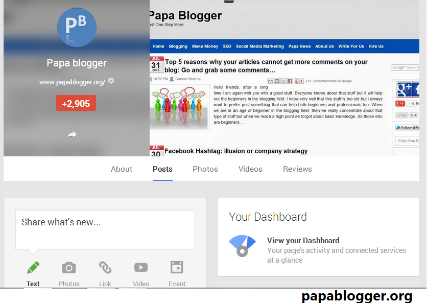
now I have found a new change in the layout of Google plus cover pic. Google has
again made it small. Initially the profile pic was in a circular frame at the
end of the cover pic but now cover pic has been divided into two sections.
1. Right
section
2. Left
Section
Left
section contains profile pic in a circular frame but the new thing is that in
the right section we have a blurred cover pic. Whatever you put in as your
cover pic that will automatically be your profile pic background in the right
section.in the left section below your profile pic you can find your working industry,
institution and number of people in your circle.
Take a look
When
we come to the right section we saw our new layout of cover pic by Google plus but
this time it is in small size. Here I am providing you the pic of my Google
Plus profile and my blog’s Google plus page so that you can easily see the new
change.
What you
think about the new layout of cover pic by Google plus?
According
to my point of view I really appreciate the new layout of the cover pic made by
Google team but still I am dissatisfied with the loading time and the circular
fame in the profile pic. When we say a ‘photo frame’, an image of a rectangular
frame or square frame comes to our mind. Putting a pic in circular frame is novelty
but there is not really much I can do. Google plus isn’t mine and I can just
share my views.
About the Author
 Sumit Sharma
He is a technical blogger and loves to blog. His writings includes new and interesting techies related to SEO , SMM and many other fascinating facts about blogging world. Follow author on Facebook, Google plus, Linked In , Stumble Upon, Pin interest.


 Posted in:


